Online learning: a graphical story
The following graphs and images tell the visual story of a very busy year of learning and teaching online!
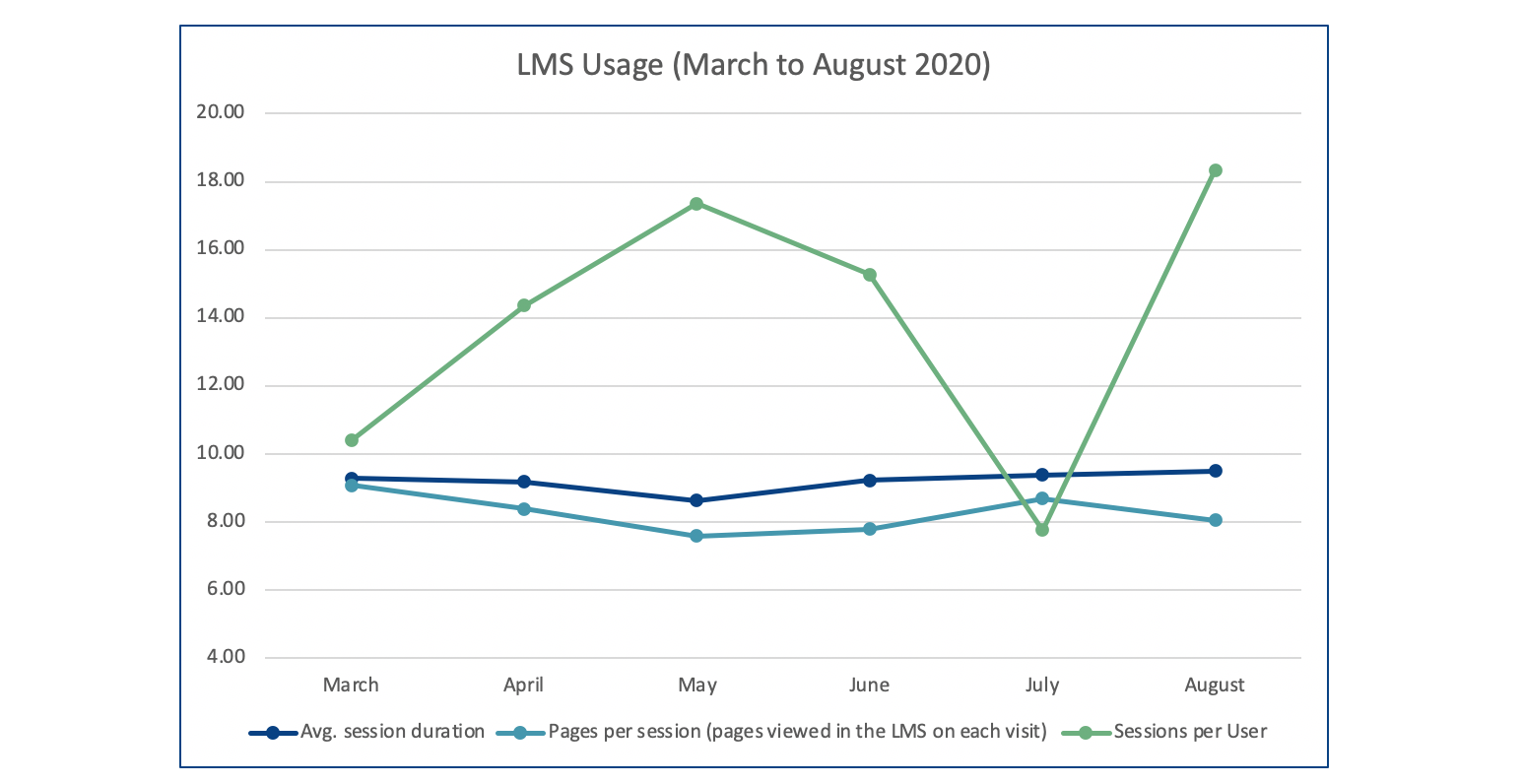
Learning Management System (LMS) usage
LMS usage increased significantly earlier this year as expected with the move to fully online learning and teaching in March. The graph below shows the peaks and troughs of usage from March until August this year. Whilst the session duration and pages per session remain fairly constant throughout the year, the sessions per user peak around May in the lead up to end of Semester 1 final assessments and exams, and drop briefly in the mid-semester break.
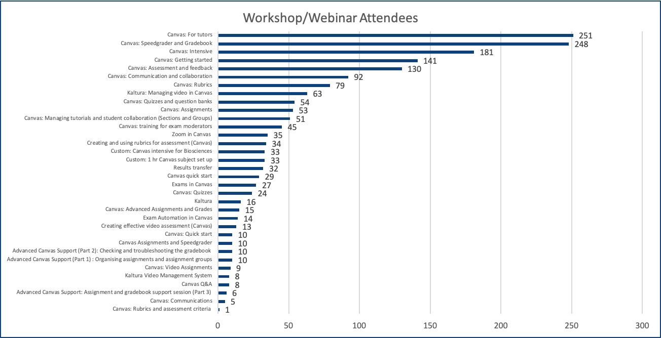
Professional development workshops and webinars
Workshops and webinars have been in high demand throughout the year, with topics such as Speedgrader, Gradebook, Assignments and Collaboration topping the list of most attended workshops. Learning Environments runs workshops throughout the full academic year which are now all online, and accessible as a recording if you would like to watch in your own time. Register for LMS Workshops and Webinars.
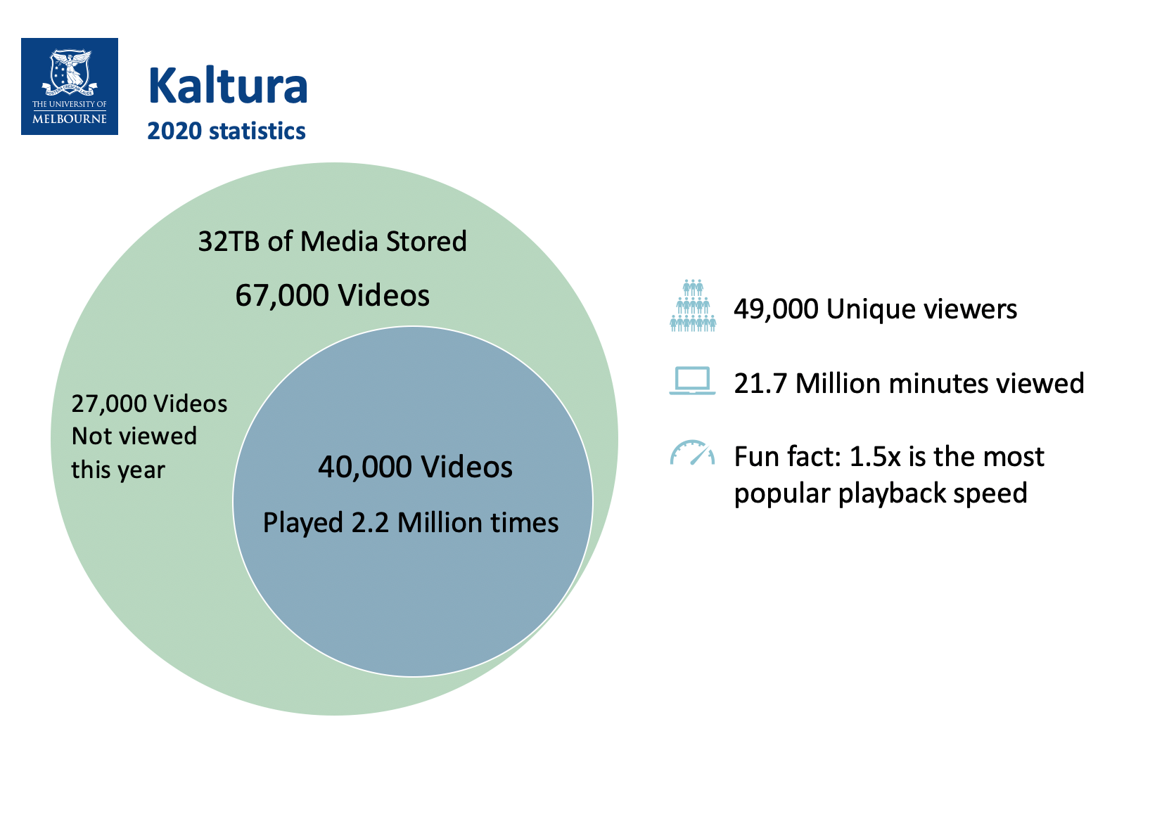
Kaltura Video Management System (VMS)
Kaltura statistics show an incredible amount of usage with over 40,000 videos played so far this year! Fun fact: 1.5x is the most popular playback speed!
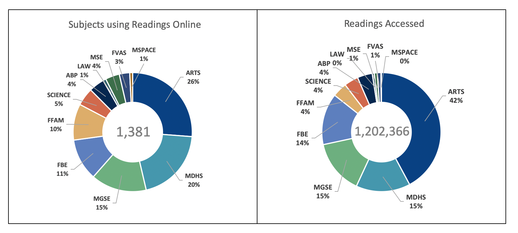
Readings Online
Readings Online data shows over 1.2 million readings have been accessed throughout the year to date!
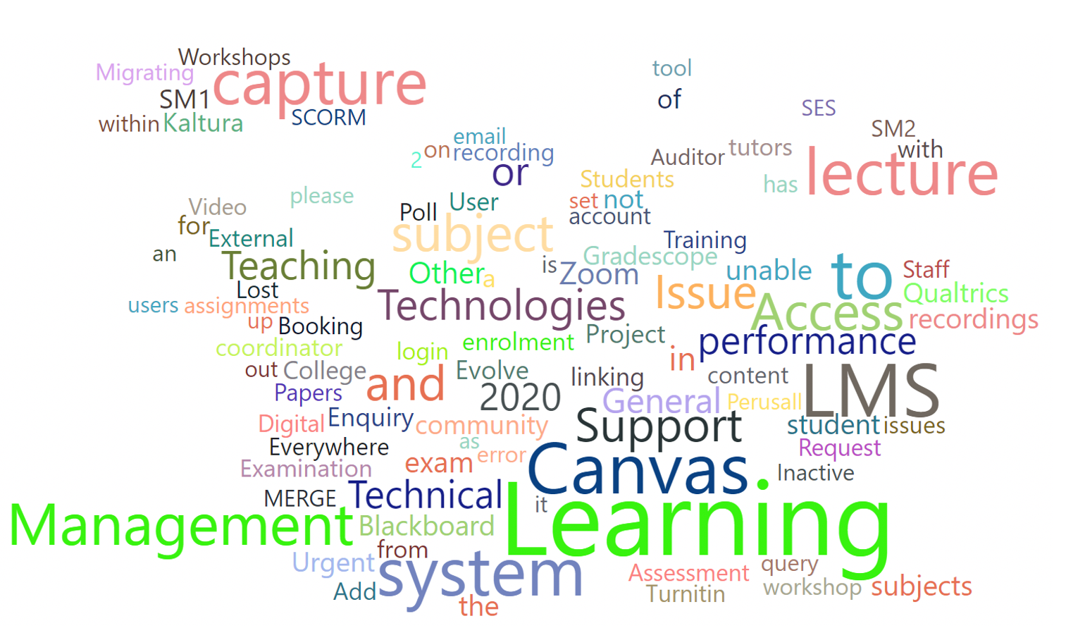
LMS enquiry types
Enquiries regarding the LMS were captured and presented using the following word cloud; showing the most frequent words in enquiries represented in larger text.